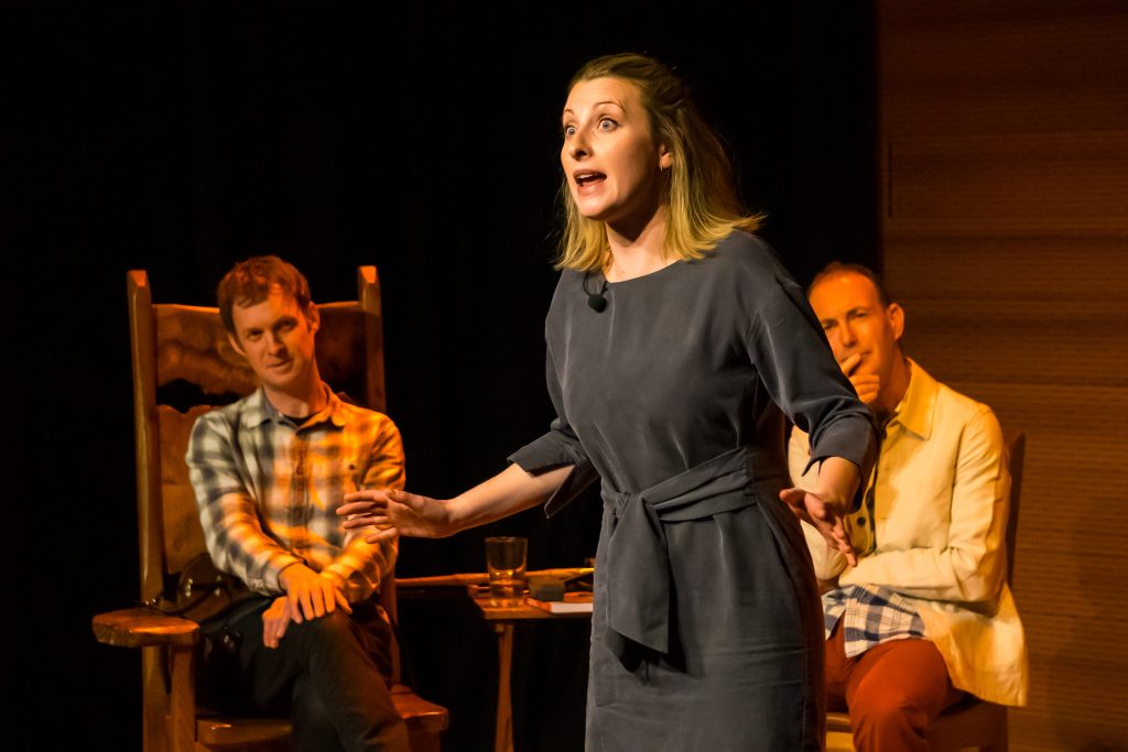
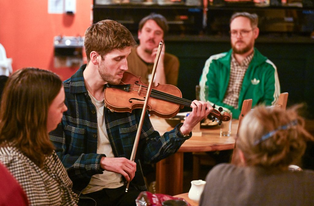

The Poster Rant and how to avoid it
Guest blog by Highland promoter Jennie Macfie
Whenever two or three promoters are gathered together, the conversation will eventually turn to posters and lengthy, heartfelt rants will ensue. Voices may be, and often are, raised and sometimes fists come into contact with table tops to emphaise points. Posters are a highly contentious subject guaranteed to raise the blood pressure. Why?
Overprinting. Most posters have to be overprinted with the date and time of the gig, venue address, ticket price, funders’ logos, often requiring working out very tight spacing on a temperamental inkjet printer. Often it’s easier printing the info onto peel-off sticky labels, and sticking them on, one by one – but NOT when faced with a stack of A5 fliers.
How to help: Leave a good sized white, unprintedspace at the foot of the poster, remembering that promoters need to tell people when and where the gig is, how much tickets are and where to get them, and may have a duty to add funders’ logos. Fliers should have full tour info. Send posters and fliers in plenty of time. Two months is not too soon.
Putting up posters. There is no Postering Fairy and posters in a rural situation are still key to getting the audience in – your audience. Local shops, cafes, restaurants, hotels, tourist attractions, libraries, bus shelters, village noticeboards – which is why promoters need A4 posters. No shop, cafe, etc etc has space for a village’s-worth of A3 posters.
Drawing pins, bluetak, sellotape are essential items in the postering kit and so is a laminator. Any poster that is going to be exposed to Highland weather needs laminating and this also takes time. Postering in cold weather is hellish work, end of story.
How to help: Supply us with A4 as well as A3. Send posters in plenty of time – two months before the gig is not too soon. Yes, I know I’m repeating myself.
Poster design. There is nothing more soul-destroying than standing in a bus shelter in the middle of nowhere, fingers numb with cold, wrestling with the sellotape to put up a poster which hardly anybody is going to notice because a design which may have looked stylishly moody and dramatic on your computer screen is nearly invisible on a Highland roadside in the low light of winter. Even in summer, your design has to be able to stand out on a village noticeboard surrounded by brightly-coloured ads for bring & buy sales, coffee mornings, etc. Even so, it’s still no use unless the design is engaging enough to make it look like the gig is worthwhile spending hard-earned cash on. That’s what the poster’s for, to attract a) attention and b) an audience. (Who knew?)
How to help: budget to pay a proper designer for your CD cover and poster design. It’s as much of an investment as getting a good producer.
Another thing or two to remember about poster design.
i) Designs that work as ads in print media often don’t work as posters. Print out your rough design and put it up on a wall. Walk across the room. Turn off most of the lights. Can you see any detail in your design? Yes? Good. No? Back to the drawing board.
ii) Repeated images work. If your poster design ties in with your CD cover, website, Facebook page image and print ads, each multiplies the impact of the others.
Posters that worked.
 Nobody in the village, including me, had heard of Szapora; then I had a call offering a gig at a knock down price to fill a cancelled night in their tour. We expected maybe a couple of dozen people to turn up – instead we nearly sold out. The hat, the musical notes, and the sun tell you instantly what to expect. Dancing in the aisles and joy unconfined – a total result!
NB This is the CD cover – the poster was larger and rectangular.
 Alternately, you can stick to the tried and true formula of a photo of yourself/selves. Make it a good one. Make it bright and striking. If you can’t afford to print colour, be photographed against a white background, and print on white paper leaving plenty of space for overprint.
Mairearad and Anna’s early poster (right) is a good example of a strong black and white image.
Orkestra del Sol‘s branding is exemplary below – a clearly recognisable house style from stage costumes to videos to websites to press ads to posters to CD covers to merchandising. That’s the way to do it!

Posters that didn’t work
Tempted as I am to name and shame, it wouldn’t be fair. You know who you are.
Thank you for listening and may all your tours be sold out.

